Connecting & Linking
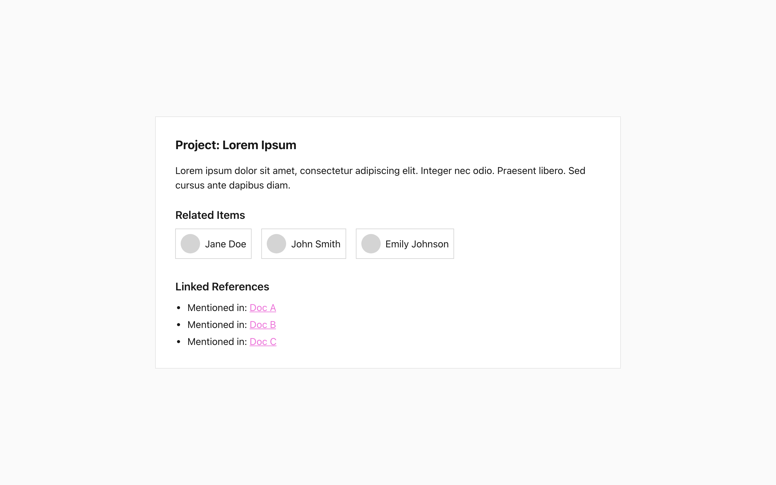
Design a screen or small flow for connecting related items: accounts, tools, pages, contacts, or steps. The user should be able to see what is already linked, choose something new to connect, and confirm the relationship without losing context.
Make the connection logic visible. Show source and target clearly, use a consistent pattern for linked, available, and disconnected states, and make it obvious when a link is directional, bidirectional, or pending approval. If the flow spans multiple screens, keep the previous selection visible as the user moves forward.
Include the moments that usually break these flows: no matches, already connected, connection failed, and edit or remove link. Each state should tell the user what happened and what to do next. Keep the primary action obvious, but let the user back out or revise the connection before it is saved.
To make the flow more engaging, incorporate micro-interactions that respond to user actions, giving immediate feedback and a sense of progress.
Better at UI design with every challenge
Select complexity and generate challenge.
Pick a platform.
Get design challenge updates in your inbox
New prompts and challenge updates. It’s free.